
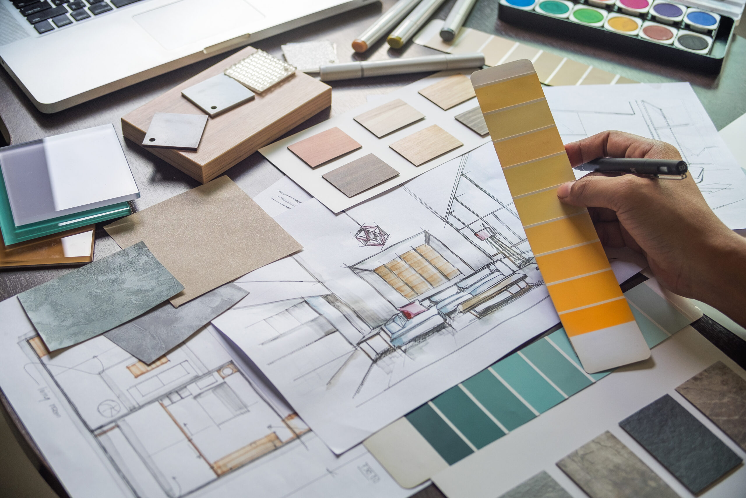
Color is more than decoration; it is strategy. In luxury interiors, the right palette can elevate a room from simply beautiful to unforgettable. At K. Nicole Studios, we view color as a foundation of design, not an afterthought. By understanding how hues interact, influence mood, and define style, designers gain an invaluable tool to tailor art and interiors that feel timeless.
Why Color Matters in Luxury Interiors
Color is often the first impression in a room, setting the emotional tone before furniture or finishes are even noticed. In high-end design, subtle shifts in tone such as the difference between warm taupe and cool gray can dictate whether a space feels serene, sophisticated, or striking.
- Atmosphere Creation: Blues and greens establish calm sophistication, while golds and deep reds suggest opulence.
- Spatial Perception: Lighter palettes open up spaces, while darker tones create intimacy and depth.
- Harmony with Art: A painting’s palette can either anchor a room or compete with it. Thoughtful pairing ensures harmony, not distraction.
Color Psychology in Design
Luxury design clients often respond to how a space makes them feel, even if they cannot articulate why. That is where psychology enters.
- Neutrals: Timeless, versatile, and grounding. They act as a canvas for art.
- Warm Tones: Energizing and inviting, ideal for social spaces.
- Cool Tones: Tranquil and restorative, perfect for bedrooms or spa-like retreats.
- Bold Accents: Used sparingly, they add personality and focal points without overwhelming.
By strategically blending these elements, interiors feel intentional and tailored, not trend-driven.
The Role of Color Palettes in Art Selection
For designers, art sourcing can be a challenge. Art is subjective, but color bridges personal taste with design coherence. A curated palette approach ensures artwork enhances the overall vision rather than competing with it.
- Monochromatic Palettes: A refined, tonal look with understated elegance.
- Complementary Palettes: High contrast, high drama, ideal for statement-making projects.
- Analogous Palettes: Smooth transitions between similar hues, creating natural flow.
- Neutral + Pop: A luxury staple, grounded neutrals with carefully chosen bursts of color.
Tailored Art Solutions for Timeless Interiors
At K. Nicole Studios, we specialize in connecting designers with curated art that not only fits the aesthetic vision but also amplifies it. By focusing on palette-driven sourcing, we make the art selection process seamless, strategic, and aligned with the emotional goals of each space.
Whether the project calls for calming seafoam and ivory, or bold sapphire and gold, color becomes the throughline that transforms interiors into living works of art.
Comments are closed