
In luxury interiors, balance is everything. While textures and proportions play a role, one of the most powerful tools at a designer’s disposal is the color wheel. Used by artists and designers for centuries, the wheel organizes hues into relationships that guide sophisticated palettes.
Understanding the Color Wheel
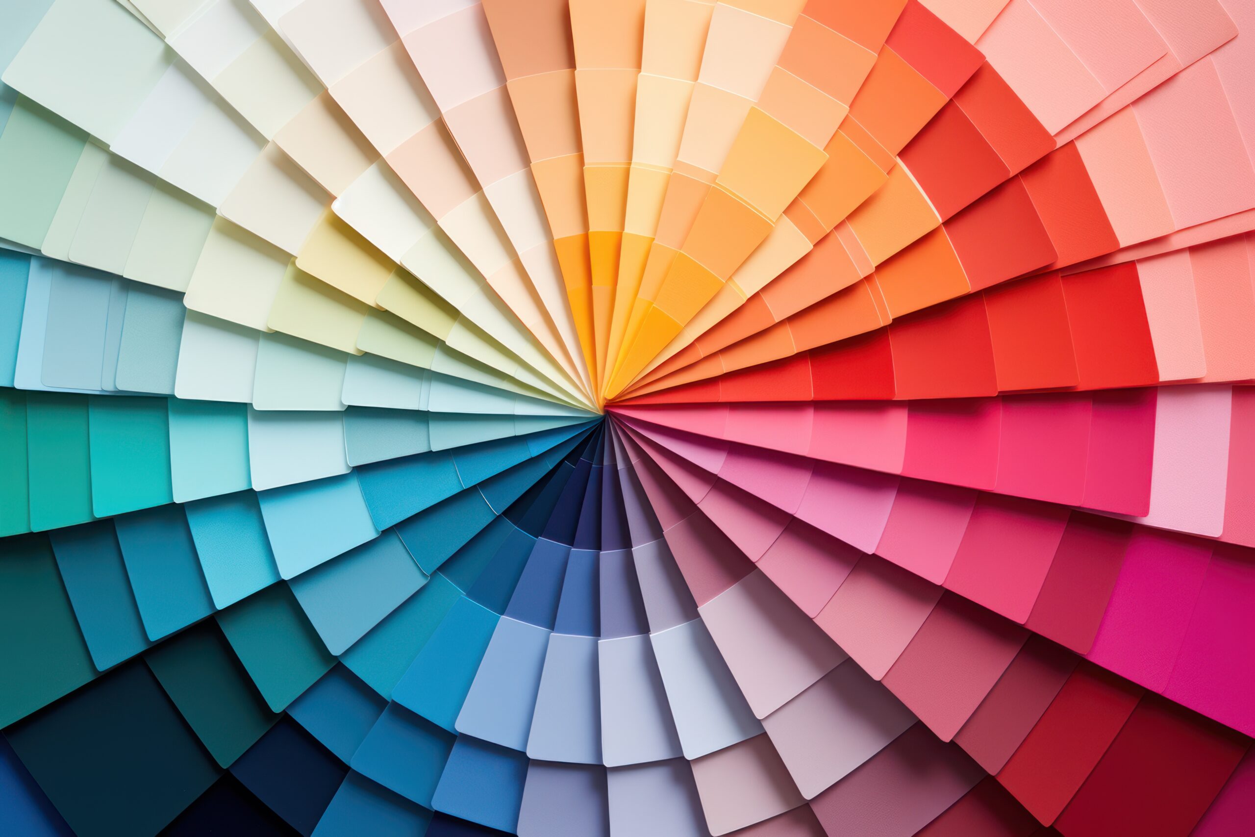
The modern color wheel is divided into primary (red, blue, yellow), secondary (green, orange, violet), and tertiary hues. This organization allows designers to quickly identify which colors harmonize and which contrast.
- Complementary Colors: Opposites on the wheel, like blue and orange. In interiors, this pairing creates striking contrast, perfect for bold, modern projects.
- Analogous Colors: Neighbors on the wheel, such as green, blue-green, and blue. These create smooth, calming transitions, often used in spa-inspired spaces.
- Triadic Palettes: Evenly spaced colors, like red, blue, and yellow. Triads feel energetic and balanced but must be softened with neutrals for luxury interiors.
Application in Art and Interiors
- In Large Rooms: Complementary pairings add energy and focal points.
- In Smaller Spaces: Analogous or monochromatic palettes avoid overwhelm.
- With Art: Selecting art based on wheel relationships ensures cohesion. Abstracts with triadic palettes can tie together disparate room tones, while neutral art balances bolder interiors.
Why It Matters for Luxury
Clients may not know the terminology, but they instinctively sense harmony. Rooms guided by color theory feel intentional, elegant, and timeless. The color wheel bridges artistry and psychology, making it indispensable for high-end design.
Comments are closed